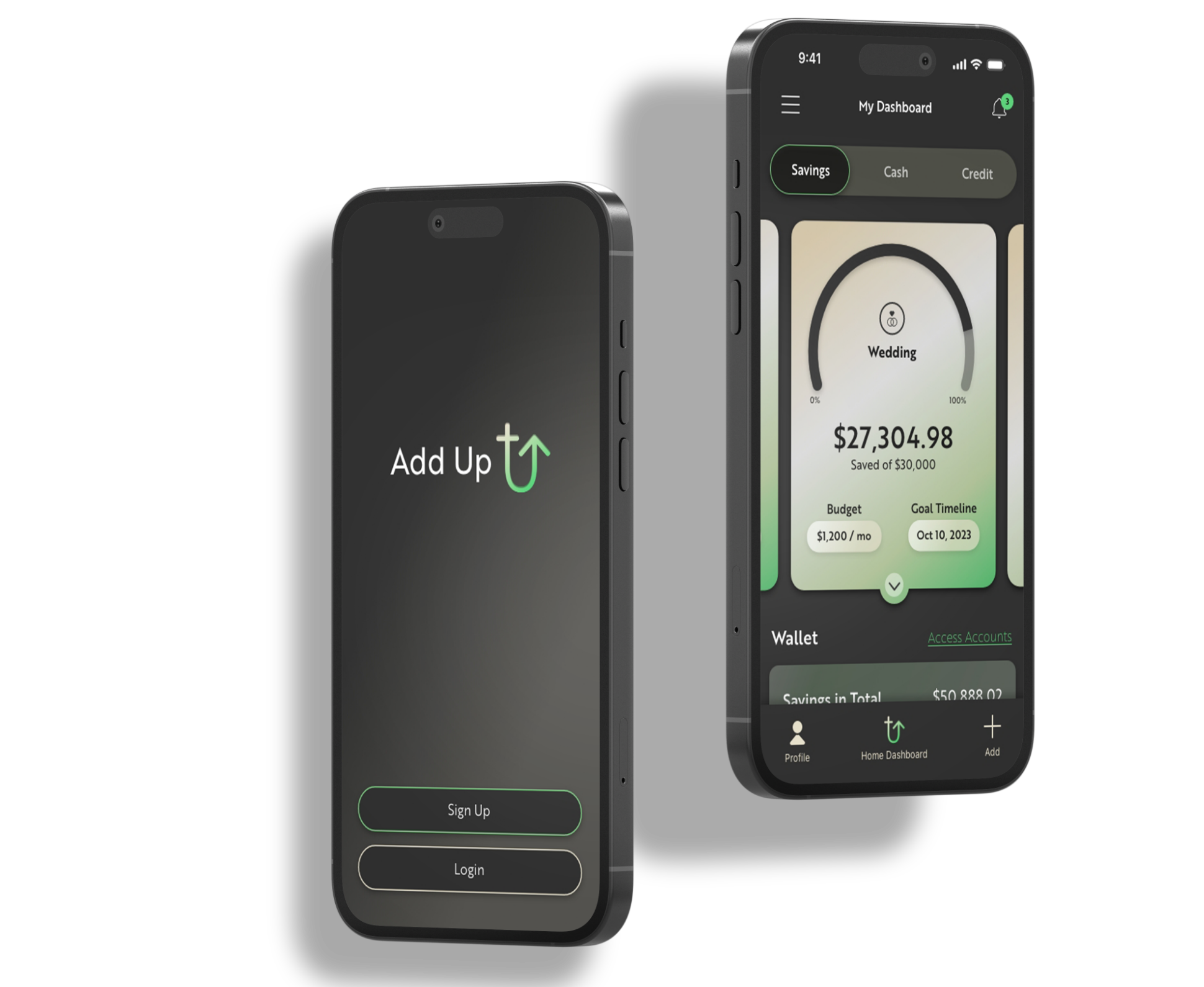
Add Up

A UI/UX Case Study for a
Financial Savings App
About the Project
The main goal of the project was to design an app that makes it easy to create savings goals that the user can track all the way to the day of purchase. The app is meant to help users build and track their spendings so they can eventually purchase and invest in what they find valuable.
The Problem
Keeping track of various savings accounts and over all finances can seem tedious or scattered. Not having everything involving your finances in one place can get very stressful and too often saving for larger items can feel very overwhelming that it is easy to just give up.
The Solution
Add Up is suitable for users looking to create personalized savings goals that are easily manageable. They are able to keep track of everything involving cash, credit, transactions, and more. It makes saving easier having your wallet all in one place.

Original sketeches
When I first started this project I had so many ideas in my head. I began by drafting out sketches that would help me gather ideas of which types of patterns and functions could work best. There are a lot of finance apps out there so I did my best to think of layouts that would be original but still familiar enough to the user.

Sitemap
Once I was happy with my initial layouts I began working on the user flow. Since Add Up is intended to help users save for their various goals the objective was to have them easily access their savings accounts throughout the app. I decided the best way was through their Home financial dashboard and menu.

Low Fidelity Screens
With the userflow mapped out I then started on my low-fidelity frames to give an even more constructive layout based off my objective. I started to add other elements that could also be included on the financial dashboard. Then decided how the menu would appear.

User Testing
The purpose of this usability test was to ensure the plan for the product’s functions, features and overall goals were in line with what users needs. By I had them first login, then immediately access their savings. Once they did, I asked if they would think of accessing it anywhere else throughout the app (my aim was to get them to the menu.
Task 1
Login to app
100% Successful
Task 2
Access savings goals
70% Successful
Task 3
Access savings goals in menu
20% Successful
Pain Points
Understanding and learning about my tester’s pain points made my final product much more intuitive. They all had very similar suggestions to help provide a solution. I knew the first thing I would need to change is make the savings accounts more apparent once they are in the app.

Branding Kit
Now that I had all of the information I needed to design the rest of my screens I started working on the brand style guide. Here is a look into the key elements I chose that would bring to the life Add Up’s brand. I aimed to have the brand give off the feeling of growth, professionalism, and simplicity. Because I wanted the user to feel secure, encouraged and never overwhelmed.

Final Screen Designs
Then I began implementing these brand attributes to my final screens. You will see I have added elements in place based off my user testing that was different than my initial low fidelity screens. These changes made a huge difference in the problem I was tryin to solve.

I learned so much throughout this process. I stretched myself in design by choosing to go for a more masculine product with dark black/green theme. I am very happy with how it turned out. Couldn’t have done it without my amazing testers who helped make Add Up all the more better.
